I love Graham Pullin's book and recommend it highly!!
==========================
All Technology Is Assistive Technology
Six dispositions for designers on disability
Unknown Armature: Body Socks / Sara Hendren
In 1941, the husband-and-wife design team, Charles and Ray Eames, were commissioned by the US Navy to design a lightweight splint for wounded soldiers to get them out of the field more securely. Metal splints of that period weren’t secure enough to hold the leg still, causing unnecessary death from gangrene or shock, blood loss, and so on.
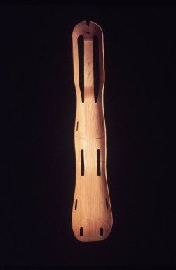
The Eameses had been working on techniques to mold and bend plywood, and they were able to come up with this splint design—conforming to the body without a lot of extra joints and parts. The wood design became a secure, lightweight, nest-able solution, and they produced more than 150,000 such splints for the Navy.
Over the next decade, the Eameses would go on to refine their wood-molding process to create both sculpture and functional design pieces, most notably these celebrated chairs:
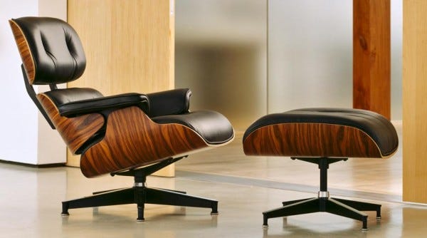
Graham Pullin, in his book, Design Meets Disability, cites this story as an example of a seemingly specialized design problem—a medical aid for disabled soldiers—that inspired a whole aesthetic in modernist furnishings. The chairs that launched a thousand imitators, and a new ethos of simple, organic lines in household objects.
It’s easy to assume that the innovation would more often happen in reverse: that a generalized design solution would “trickle down” to the narrow confines of adaptive and assistive aids. But this example, as Pullin points out, suggests that disability concerns are an overlooked area of aesthetic generativity, with relevance and impact for design far outside its starting questions.
More than that, I think it demonstrates why everyone should pay more attention to disability matters.
You might imagine that “disability studies” is just one more category of identity that’s purely for political advocacy, interesting only to those directly affected by issues of accessibility, accommodation, or special rights. But “disabledness” is a far more slippery designation than even the other notorious ways cultures have of historically organizing themselves—along the lines of race, gender, ethnicity, and the rest. And while these latter categories have also been shown to be much less stable than once thought, disability is another matter altogether. There are at least two big reasons why disability concerns are everyone’s concerns.
First, it’s a false divide to make a we/them: either able-minded, able-bodied, or disabled. After all, how cultures define, think about, and treat those who currently have marked disabilities is how all its future citizens may well be perceived if and when those who are able-bodied become less abled than they are now: by age, degeneration, or some sudden—or gradual—change in physical or mental capacities. All people, over the course of their lives, traffic between times of relative independence and dependence. So the questions cultures ask, the technologies they invent, and how those technologies broadcast a message about their users—weakness and strength, agency and passivity—are important ones. And they’re not just questions for scientists and policy-makers; they’re aesthetic questions too.
Second, in many cultures—and certainly in the US—a pervasive, near-obsession with averages and statistical norms about bodies and capacities has become a naturalized form of describing both individuals and populations. But this way of measuring people and populations is historically very recent, and worth reconsidering.
Disability studies scholar Lennard Davis writes that
“before the nineteenth century in Western culture, the concept of the ‘ideal’ was the regnant paradigm in relation to all bodies, so all bodies were less than ideal. The introduction of the concept of normality, however, created an imperative to be normal, as the eugenics movement proved by enshrining the bell curve (also known as the ‘normal curve’) as the umbrella under whose demanding peak we should all stand. With the introduction of the bell curve came the notion of ‘abnormal’ bodies. And the rest is history.” Bending Over Backwards: Disability, Dismodernism, and other Difficult Positions
You all know the bell curve, of course.

It’s the source of all talk about how individuals measure up, relative to others. In case you doubt this obsession, I invite you to witness the conversation among parents of young children: It’s all percentiles, and milestones, and being “ahead of the curve” with respect to each month of a child’s development. Exceptional normal-ness is what they prize above all else, and it’s these measurements that can reassure anxious caregivers, despite little correlation between these measures and a lifetime of wellness, healthy relationships, or sustaining work.
Again, Davis reminds us that this is a recent set of cultural ideas, so unquestioned now that these standards have a way of “enforcing normalcy.”
Of course,as Davis writes,“it’s too easy to say, ‘We’re all disabled.’” But it’s a challenge to interrupt cultural assumptions in powerful, creative ways—and to alter wider collective thinking about one’s own individual dependence, independence, and that of others.
So how might designers and artists engage these myths about what’s normal, and make more visible, critical, and expansive technologies that keep these questions alive?
Well—it’s worth saying again: All technology is assistive technology. Honestly—what technology are you using that’s not assistive? Your smartphone? Your eyeglasses? Headphones? And those three examples alone are assisting you in multiple registers: They’re enabling or augmenting a sensory experience, say, or providing navigational information. But they’re also allowing you to decide whether to be available for approach in public, or not; to check out or in on a conversation or meeting in a bunch of subtle ways; to identify, by your choice of brand or look, with one culture group and not another.
Making a persistent, overt distinction about “assistive tech” embodies the second-tier do-gooderism and banality that still dominate design work targeted toward “special needs.” “Assistive technology” implies a separate species of tools designed exclusively for those people with a rather narrow set of diagnostic “impairments”—impairments, in other words, that have been culturally designated as needing special attention, as being particularly, grossly abnormal. But are you sure your phone isn’t a crutch, as it were, for a whole lot of unexamined needs? If the metrics were expansive enough, I think the lines around what’s designated as assistive would start to get blurry pretty quickly.
Undoing the distinctions between design for disability and design in general yields a couple of goods: It brings new attention to technologies that are profound in their use and impact on physical and political accessibility. The advanced replacement limbs, all-terrain wheelchairs, and exoskeletons you can find now are evidence of this new attention.
It also brings a productive uncertainty and a powerful friction to the task of designing technologies of all kinds. Whether you’re designing for an established need or seeking an application for a technical novelty, you might take more time before confidently assigning it to a user, or to over-determining its modes of deployment—it might be for practical ends, or for play, or for something else you’ve not yet imagined.
Instead of labeling some technologies and not others as assistive, let’s start like this: We’re all getting all kinds of help from the things we make. All kinds of help, all the time, for our many material and social and educational and political needs. Private needs and public ones. No one is exempt. Then the questions get really interesting: What can a body do? What needs are you interested in? Who might use which thing for what? Where might the surprises be? How might a familiar thing morph into something else altogether?
In the name of good friction, then, I want to suggest some possible dispositions for designers and artists taking a look at ability and disability.
- Question invisibility as the assumed goal.
These hearing aids are reconsiderations of an until-recently neglected prosthesis. Long designed with dubious “flesh toned” plastics and metal circuitry, these devices are now a site of generative research about the nature of hearing. The Victoria&Albert museum’s 2006 exhibit, Hearwear, commissioned designers to reconsider hearing as an under-examined area of exploration.
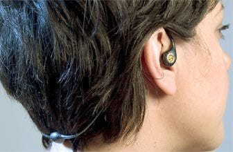

“The Beauty of Inner Space,” a design by Ross Lovegrove, above, has more in common with jewelry than medical gear. His proposal would have this aid amplify and mute sounds at the user’s discretion—highlighting sounds you want to hear and canceling out others. And the Svara hearing aid, below, is a proposal to make amplification gestures blend seamlessly with other naturalistic movements: moving the necklace’s “pendant” up or down, for example, or tucking one’s hair behind the ears.
In other words, one strand of design might be devoted to making hearing aids as discreet as possible—to hide its function from view. But another round of questions becomes more interesting altogether: What might a hearing aid also do—or do instead—that’s never even been considered?
See more hearing aids in the exhibition covered by Designboom.
2. Rethink the default bodily experience.
Researchers at Georgia Tech re-imagined wheelchair navigation for quadriplegic users—with a tongue driver. It’s a wireless device that allows those who have high-level spinal cord injuries, and therefore little or no limb movement, to operate computers and their own electric wheelchairs.

Placing the controls in headsets, say the researchers, made them susceptible to getting jostled and needing frequent recalibration. Moving the entire system inside the mouth makes it stable and reliable, and the tongue’s receptors are sensitive enough that the user can move a cursor on a screen and direct a wheelchair in the way a joystick would have in the past. And the entire system can be programmed for many complex commands at once.
Instead of approximating a hand movement with joystick directionality, this system exploits a built-in sensitivity goldmine, protected from outside elements. Sometimes heightened functionality is about reconsidering typical adaptations entirely, inverting the expected sensory mechanism.
3. Consider fine gradations of qualitative change.
I’m as much a fan of the exoskeletons and bionic limbs as the next person. But there are far more subtle changes for bodies over the lifespan for the designer also to address. Some of the most interesting ideas pose ways to “edit” built environments that already exist, to accommodate more bodies more of the time.
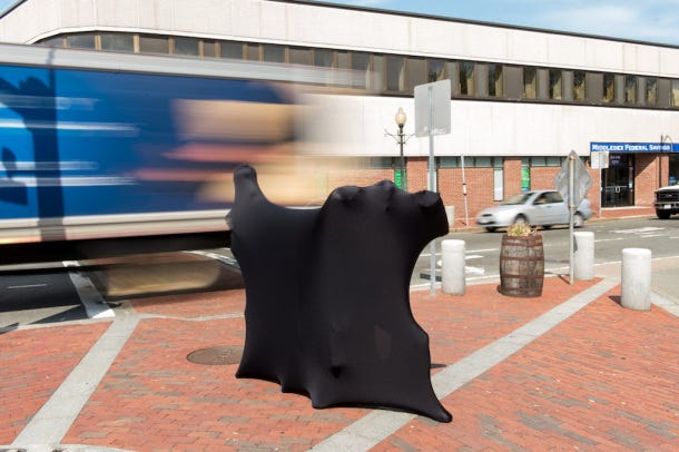
The Wanderest is just that kind of edit: a perch for pausing on the otherwise relentlessly forward-looking streetscape. As cities consider their usability for aging populations, this kind of accommodation might be as important as newer, “smarter” nursing home environments. Could small structures like these make streets more navigable, make independent living more attainable for a longer period?
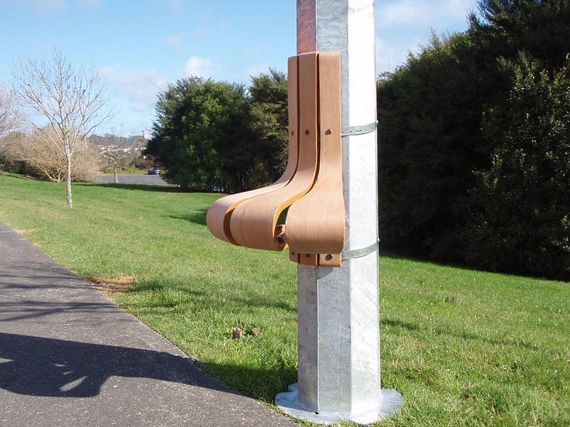
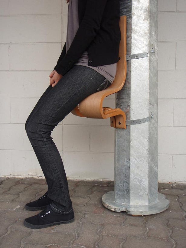
So many medical technologies for treatment are just that: medicalized. They operate with the assumption that a change in ability is primarily a biological condition, without thought for the broader ways the built environment can expand and shift to welcome multiple kinds of bodies and experiences.
4. Uncouple medical technologies from their diagnostic contexts.
Temple Grandin is a research scientist in animal husbandry and now a well-known self-advocate for people with autism spectrum conditions. Grandin has revolutionized the cattle slaughter process, creating far more humane tools and practices for a huge percentage of slaughterhouses all across the U.S.
Along the way, one of the technologies she developed is a “hugging machine” that provides a deep, calming pressure to cows as they enter the conveyor belt toward their deaths. The pressure creates stillness, reduces panic, and makes for a cleaner, less violent death for the animal.
As she developed this machine for cattle, Grandin intuited her own need for an adaptive “hugging machine” that would provide her with a proxy for human touch. For someone whose interpersonal interactions were often confusing, she found that this machine delivered a kind of affection and calming influence that she needed but wouldn’t get from a typical kind of human relationship.
Artist and MIT professor Wendy Jacob proposed a collaboration with Grandin to modify and replicate the hugging machine—in the form of these “squeeze chairs”—furniture that gives you a hug.
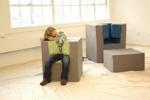
What happens when a tool used for therapeutic reasons also points outward from a diagnostic mode toward something more ambiguous, entering the realm of the poetic? Why shouldn’t a critical object like this one possess more affect, be more responsive? When an object’s uses and users get less clearly marked, new stories about that object and its users can suddenly emerge.
5. Design for one.
Michail Vanis, a young interaction designer charged with a design brief about “the future of work,” started to think about his grandmother Despina’s retirement from her job as a seamstress—a job she valued for its camaraderie of fellow workers at their sewing machines in a shared physical space.
After her retirement, it wasn’t that Despina needed a chair or adaptive machine to allow her sew in her elder years; it was that she missed the togetherness of colleagues. So Vanis created Social Sewing, a complex of sewing machine avatars that activate when her now far-flung colleagues were also laboring in their post-work contexts.
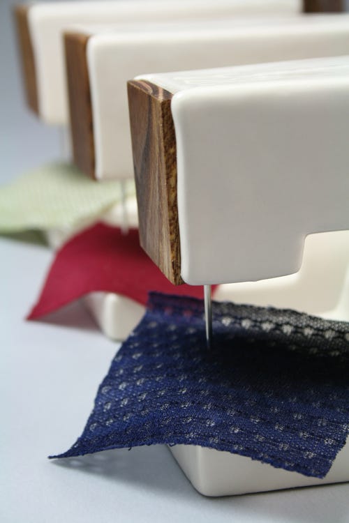
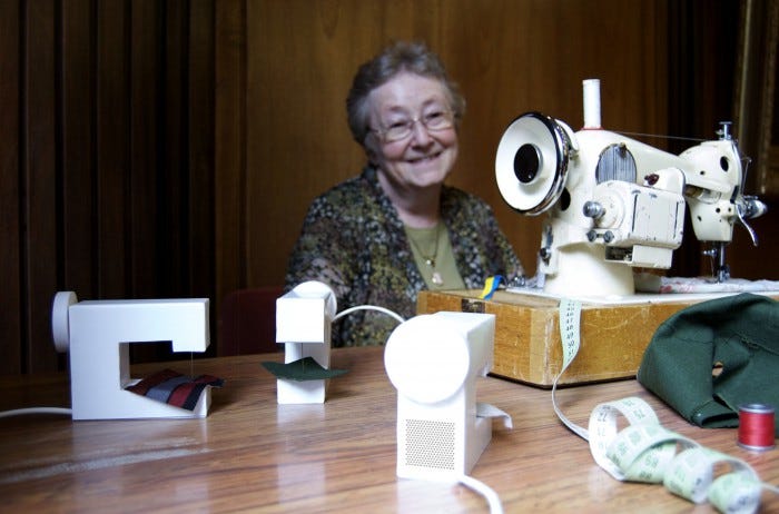
This project is about productive, radical constraints: it narrows the design question to a single user, but it suggests a much wider frame for thinking about the “future of work” in all its crucial qualitative senses.
6. And this is perhaps the most important: Let the tools you make ask questions, not just solve problems.
The tricky part with popular prosthetic design—bespoke artificial limbs and such—is an overwhelmingly dominant trend toward making people with atypical bodies “pass” as “normal.” Plenty of well-meaning designers set out to re-design an object so that its wearer won’t “appear disabled,” with the presumption that a preconception of “normal” is always desirable.
Yes—of course—some users want discreet tools! But others roundly reject the notion that all bodies should conform to some standardized or performative ideal.This kind of variability and disagreement should also be a generative friction for the designer. Designed artifacts that reveal psycho-social or cultural dynamics not typically housed in an ability/disability framework can destabilize easy notions of dependence and autonomy, passivity and agency.
Jennifer Crupi, an artist and metalsmith, makes a kind of gestural jewelry:
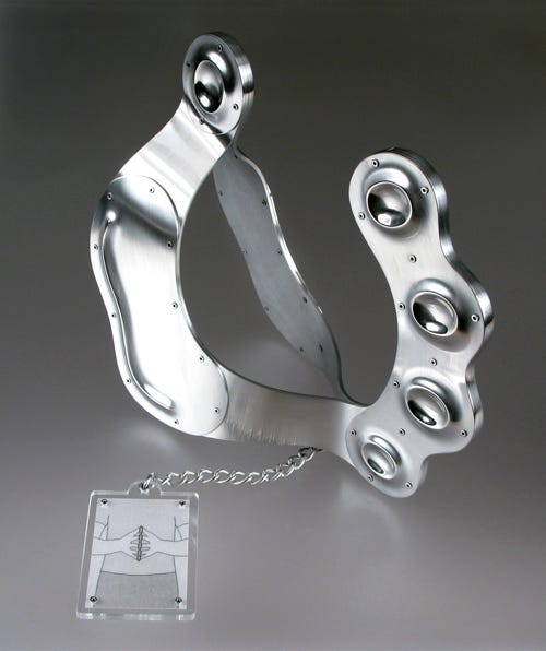
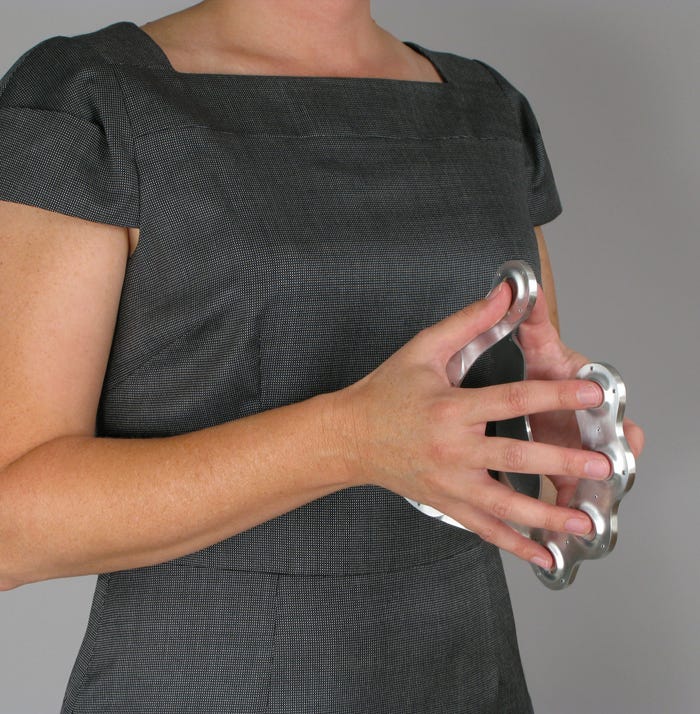
This design above, Power Gesture, forces its wearer to assume the authoritative position of steepled fingers, held confidently and calmly in front of one’s chest. An assistive device to rehearse one’s self-presentation.
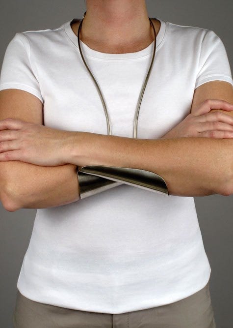
And her Guarded Gesture, above, externalizes the betrayal of emotions that’s so revealing in the crossed-arms stance. With these designs there’s a kind of comedy-with-teeth: Crupi makes a shrewd comment on the sciences of body language—and the ways humans say both what they want to express and what they wish to hide.
Questions of utility matter: Does it work efficiently? Is its power maximized? Is it user-friendly? Can it be mass produced, affordably? But questions outside utilitarian concerns also matter.Whether interrogative design, or critical design, or “design for debate,” objects and their stories can suggest a para-functionality that makes subtler needs and proxies become visible.
Allowing objects to raise and suspend questions—indefinitely suspend questions—alongside those objects designed to solve problems helps keep a complex public conversation alive about human normalcy and pathology, about needs and desires for interdependence, about the tools giving assistance to every human body.
Thanks to Graham Pullin, Katherine Ott, especially this book, Mara Mills, Tim Maly.

I’m as much a fan of the exoskeletons and bionic limbs as the next person. Battery Led Picture Light
ReplyDeleteinternet security software is really helpful software for pc . thanks for good information.
ReplyDeletePC Games Download
Nice blog admin...i glad to see your blog thanks...
ReplyDeleteSoftware FullVersion
Just Awesome!
ReplyDeletebest cracked software
download sites|Bitdefender
Mobile Security Premium Key